Understanding colorimetry, color standards, peculiarities of modern displays, and why HDR looks so bad on Windows
If you use Windows and own HDR monitor, you likely tried enabling HDR at some point. If not, I suggest trying it out before reading this post - go to Display Settings and see for yourself what happens.
Some issues you can get are - image gets darker or brighter, colors shift, saturation gets lower, mid-tones get raised, highlights get lowered, black level gets higher, etc. So, it is very unlikely that you’ll find HDR experience in Windows satisfying. Most people will just disable HDR, forget about it, and go on with their lives. However, I’m not most people and so here I am jumping into this rabbit hole.
My goals for this blog post are:
- Explain colorimetry theory - Many programmers have worked with colors for years without ever thinking how those RGB numbers are connected to physics.
- Prove to people that it is not HDR that is bad, but rather some implementations - I believe that many people underestimate benefits of HDR after seeing many bad implementations.
- Clear up some confusion around color space standards - It is extremely easy to get it wrong and not notice the error.
- Make people stop using word “gamma” - It is both ambigious and unnececary. You can always pick another word that will do better job conveying what you actually mean.
- Present strong arguments in favor of changing Windows’es SDR to HDR color conversion – I don’t want to keep switching HDR back and forth. If Microsoft changes it, maybe I’ll be able to just leave HDR enabled.
HDR can mean a lot of different things. It can mean HDR photography, HDR rendering, and who knows what else. But today we are talking about HDR Output.
Improvement HDR display bring over normal (SDR) display is twofold:
- High Dynamic Range (HDR) - Wider range of luminance - HDR displays can reach higher peak luminance, and in some cases, lower black levels.
- Wide Color Gamut (WCG) - Wider range of colors - HDR displays can rereproduce more saturated colors.
(Note that all images in this blog post are SDR images - those comparisons are just visualizations of how HDR/WCG benefits can look)
However, understanding those improvements requires us to understand the theory behind it. Measuring light is anything but easy, and so we are going to start from the very beginning.
Color vision
Electromagnetic spectrum
The way human sight works, is that we “see” part of electromagnetic spectrum in range of approximately 380-780 nm in wavelength. Electromagnetic radiation in that range is called “Light”.

(Note that displays cannot reproduce actual light for the whole spectrum - all images representing spectrum in this post are approximations)
Generally, inside human eye there are 4 types of sensors:
- Rods - sensors that primarily sense light intensity
- 3 types of Cones - sensors that primarily sense light color
The difference between those 3 types of cones is their response to different wavelengths of light:
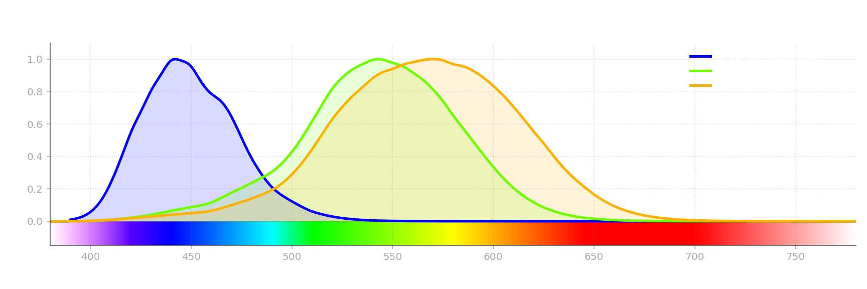
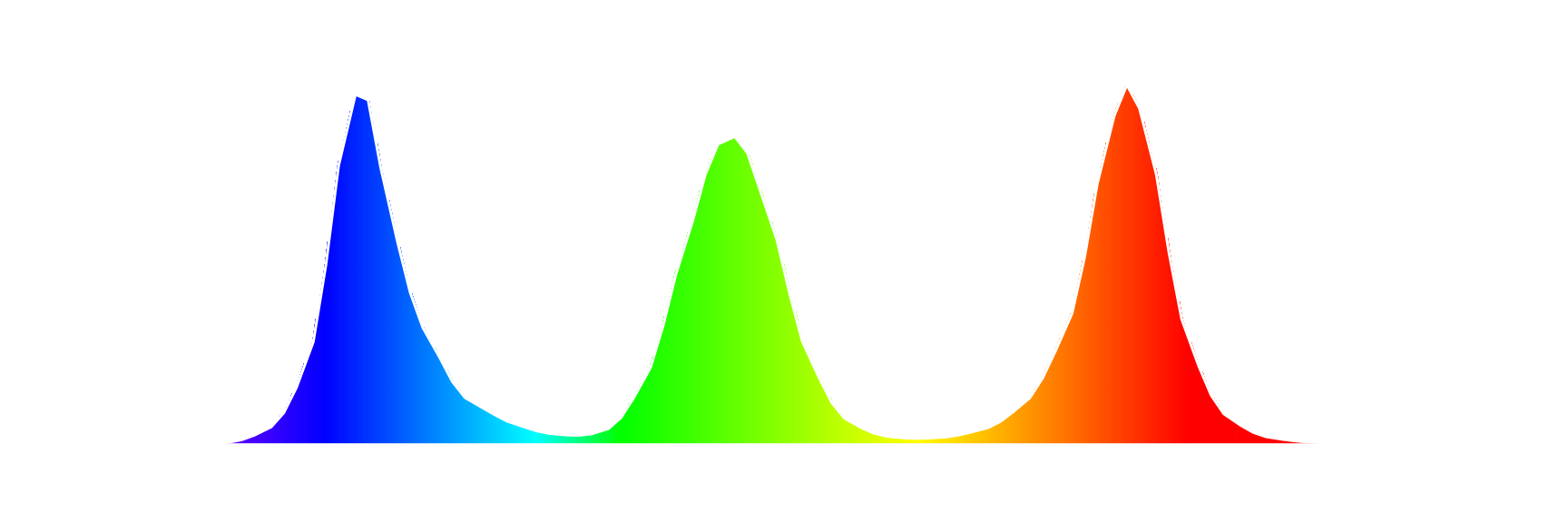
This is how human eye can not only detect light but also tell apart light of different wavelengths, and as a result, this is how human eye can see different colors. Unfortunately, light in the real world is not as simple as “light of wavelength X”. You may have noticed before that there’s no white color on those charts. Almost any light source will emit a spectrum of light of different wavelength and power. Which is how you get white - when object emits light of different wavelength, the color of said object appears as a sum of colors of those wavelengths.
Let’s look at some examples:
(All spectrum and display color gamut and luminance measurements in this post were made with X-Rite ColorMunki Photo spectrophotometer)
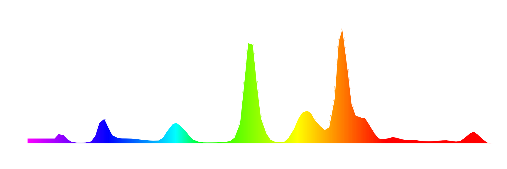
This is a spectrum of light emitted by a fluorescent lamp. Let’s look at it and try to figure out what color would it appears as to a human eye. It has 2 big peaks that correspond to orange and green, and 3 small peaks corresponding to yellow, cyan, and blue. If you mix those colors in those proportions, you get warm white. Which is correct, looking at this lamp, it indeed appears warm white to me.
This is how spectrum is perceived by the human eye. But that’s not the whole story yet. Next examples:

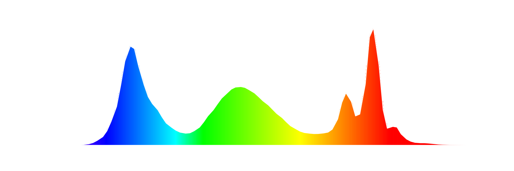
Those are spectrums produced by 3 different displays when showing white image. You can see that they are somewhat similar, but the important part here is that they are not the same spectrum. However, those 3 spectrums all correspond to same, or at least very similar color - white. This shows another property of a human vision – there are different light spectrums that are perceived as the same color by the human eye.
Luminous Efficiency Function
Color is not the only complicated part of human vision. The way human eye senses light is also complicated.
There are 3 types of human vision:
- Scotopic - effective in low-light conditions, achieved with Rods, does not have color perception
- Photopic - effective in high-light conditions, achieved with Cones, has color perception
- Mesopic - the in-between state, both Rods and Cones are used, has weaker color perceptions
We are only going to look at Photopic vision, as it is the one that is primarily used when looking on displays.
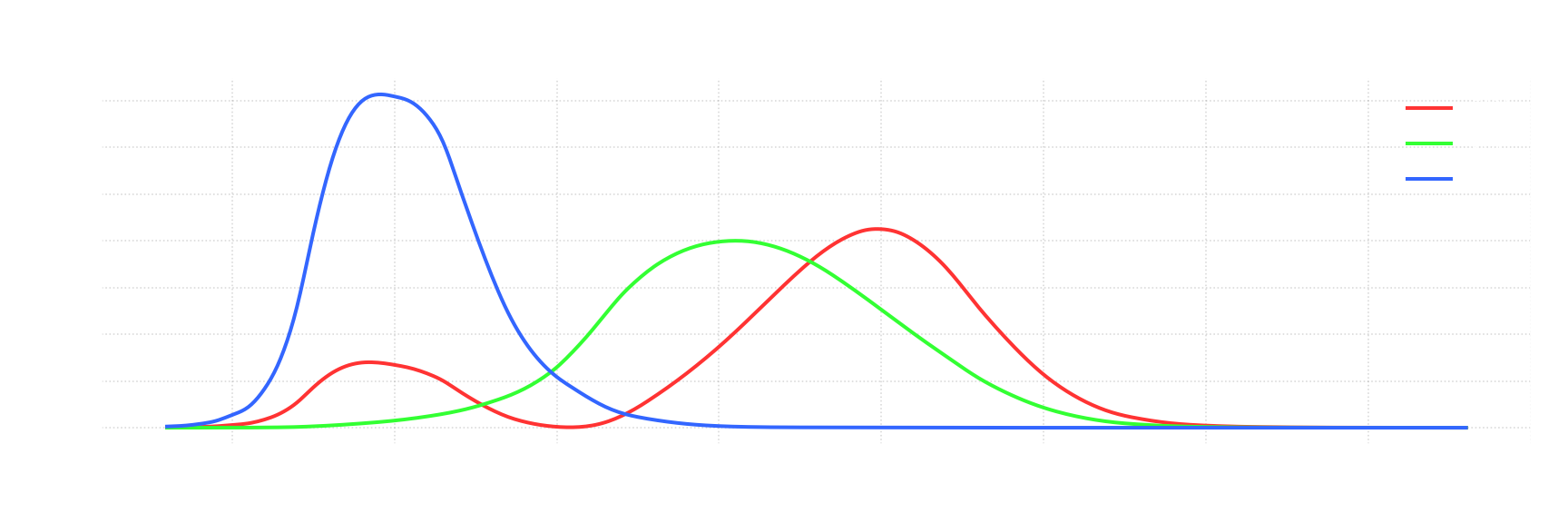
Now let’s look at how eye sensitivity changes with wavelength. Similarly to color, eye sensitivity also depends on wavelength. In 1924 CIE (International Commission on Illumination / Commission internationale de l’éclairage) measured this relation for Photopic vision:
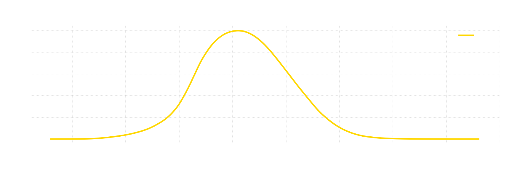
This is a Luminous Efficiency Function - function that defines how sensitive is the eye to a light of particular wavelength, relative to peak sensitivity point. You can see that for Photopic vision this point is around 555 nm, and how sensitivity gradually drops as you approach either end of visible light spectrum.
Color Matching
Now that we have basic understanding how human eye can see colors, we can now measure it. Since human eye only have 3 types of cones, we should be able to represent any unique perceptible color with just 3 numbers. Here’s an experiment where we’ll try to do exactly that:
- Pick 3 “primary” light sources - R, G, and B (aka “primary colors”)
- Prepare a white screen that is divided into 2 parts
- For each light you want to measure, do the following:
- Illuminate 1st half (target side) of the screen with a light you want to measure
- Set up primary light sources so that they can illuminate either side of the screen with configurable intensity for each light source
- Test subject then tries to match color on 2nd part of the screen (measurement side) by illuminating either side with primary light sources
- Each primary light source can only illuminate one side at a time, but different light sources can illuminate different sides
- After matching color, for each primary light source - record used intensity and which side was illuminated
Here’s a visualization for a simple case:
It shows that measured light (M) can be represented as sum of primary colors - M = aR + bG +cB, where a, b, and c is the intensity of primary light sources - R, G, and B respectively.
Here’s another example, in which we can’t directly achieve target color as a sum of 3 primaries.
We can’t have negative intensity of light, but we can illuminate the other side of the screen. In this case we can still say that - M = aR + bG + cB, we just have a term that is same absolute value as intensity of R light source, but negative.
Now that you know how Color Matching experiment is done, we can finally start looking at standards:
In 1931 CIE (International Commission on Illumination / Commission internationale de l’éclairage) did this experiment. They used following primary colors - 700 nm (red), 546.1 nm (green), and 435.8 nm (blue). Both sides of the screen were inside 2° window from the point of view of observer, which is important as color perception varies based on the viewing angle. And then they proceeded to measure whole spectrum of visible light in 1 nm increments.
After doing such experiment, and normalizing all measurements you get following functions.
They are called Color Matching Functions (CMFs). But at this point the scales of those functions are arbitrary. To arrive to the actual standard there are 2 more steps. First is to normalize CMFs to match Photopic Luminosity function. If, to a human eye, light of any given wavelength appears identially as sum of 3 light sources, then its intensity will also appear the same. We just had to figure out how much any given primary color contributes to eye sensitivity and scale each function accordingly:
Reasons for why they did this is out of the scope of this post.
We now established absolute scale for each function, but it is not particularly good for practical applications. For last step, we want to renormalize CMFs so that area under the graph is the same for each function. We’ll return to why is that useful later. Basically, we need to scale those functions for the following equality to be true:
\[{\displaystyle \int _{0}^{\infty }{\overline {r}}(\lambda )\,d\lambda =\int _{0}^{\infty }{\overline {g}}(\lambda )\,d\lambda =\int _{0}^{\infty }{\overline {b}}(\lambda )\,d\lambda }\]After locking scale for $\overline {r}$ and scaling $\overline {g}$ and $\overline {b}$, you finally arrive to standard CIE 1931 RGB CMFs:
These CMFs are basis for almost all color standards that come after it, including sRGB.
Defining First Color Space - CIE RGB
Color Space is an organization of colors. Today we are going to look at RGB color spaces - those define colors as a weighted sum of 3 primary colors, which lets us define colors using 3 corresponding numbers. CMFs that we just defined allow us to define such a color space. For light consisting of only a single wavelength of light (aka monochromatic light), you can get your numbers by just multiply its intensity by corresponding values of CMFs. For example, for monochromatic light of intensity 1.0 and wavelength of 500 nm, resulting values are: $R=-0.07173,G=0.08536,B=0.04776$. In case of non-monochromatic light math is harder, but is still similar - for any spectrum S, we use following formulas:
You can think of it as converting each wavelength into R, G, B separately, and then taking weighted avarage.
Here’s where CMFs having equal area under graph comes in handy. Let’s define “Equal Energy” (aka Illuminant E) as a spectrum where each wavelength have equal intensity C, or, to put simply, spectrum that is a straight horizontal line. Considering aforementioned property of CMFs, for such color, R, G, B calculations become:
Meaning that all 3 R, G, and B components are equal for Equal Energy spectrum. This is why we’ve previously normalized area under the graph - to get this property. This also means that for $R=1, G=1, B=1$ resulting color is same as for Equal Energy spectrum (with certain scale applied). Such point is called “White Point”, which is also part of color space definition.
The reason you need white point as a part of a color space definition, is because primary colors alone do not define which color you get when you mix those. We could have arbitrarily scaled CMFs and still end up with same primary colors, but with different color being represented by $R=1, G=1, B=1$.
With that we’ve now successfully defined CIE RGB color space: -Primary Colors:
- R - 700 nm
- G - 546.1 nm
- B - 435.8 nm
- White Point - “Equal Energy” Spectrum
Note that it doesn’t define specific physical units that we are supposed to use with this color space, so exact physical representation is not completely defined. Spectrum must use radiometric units (more on those later), but scale can be arbitrary. However, the important part is that for any light source you can convert it to R, G, and B values, and ratio between those components will always be the same, independently of the scale. In other words, for any spectrum, independently of scale of its values, CIE RGB color space allows you to calculate chromaticity of said spectrum.
Chromaticity
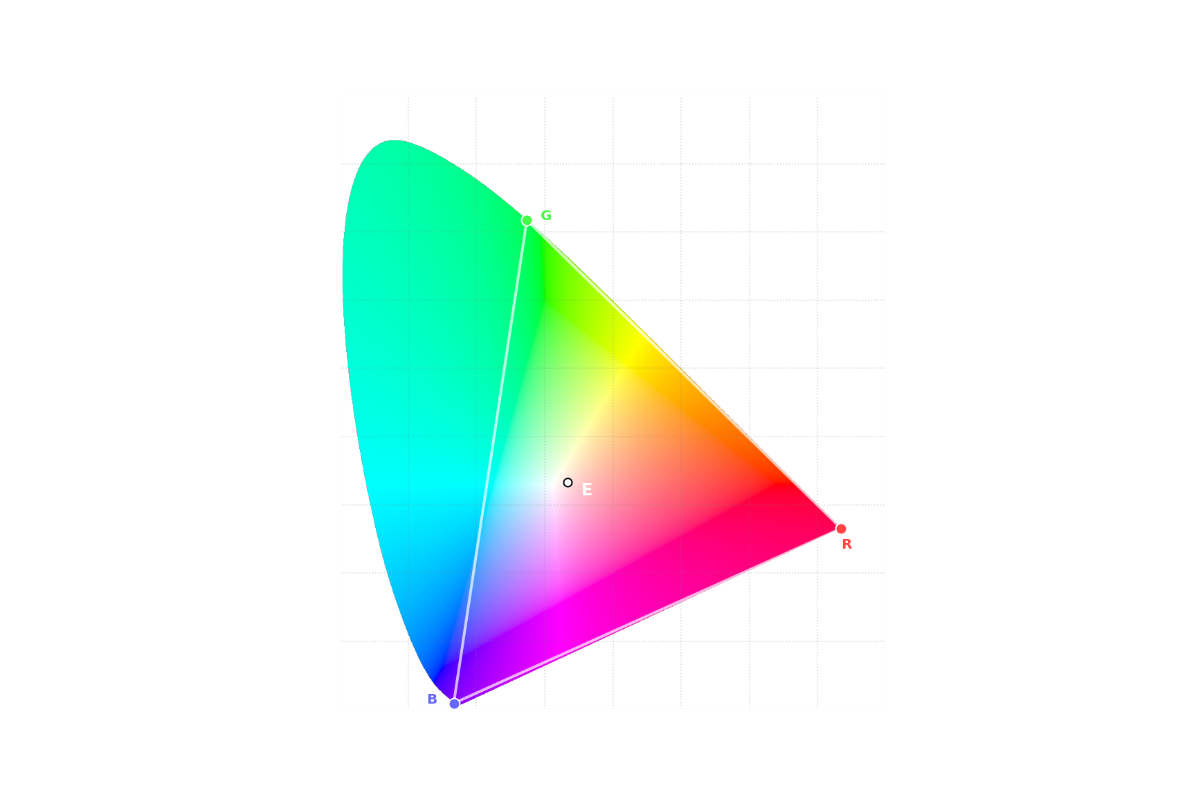
Chromaticity - is objective measurement of color irrespective of its luminance. Since we now have defined a color space, we can now visualize its chromaticity.
For values R, G, and B in CIE RGB color space, we can represent chromaticity as:
Sum of R, G, and B components represent luminance, so if we divide each respective component by that sum, we are left with values that represent chromaticity. However, in doing so we’ve introduced a peculiar property $r+g+b=1$. You can express one of those 3 values with 2 other ones, meaning that chromaticity can be represented with just 2 numbers. To represent color you need 3 numbers, you take out luminance, which is a single number, and so you are left with just 2 numbers.
So for visualization of chromaticity we only need to visualize 2 out of those 3 values - we’ll visualize r and g. This way we are constructing standard CIE rg chromaticity diagram:
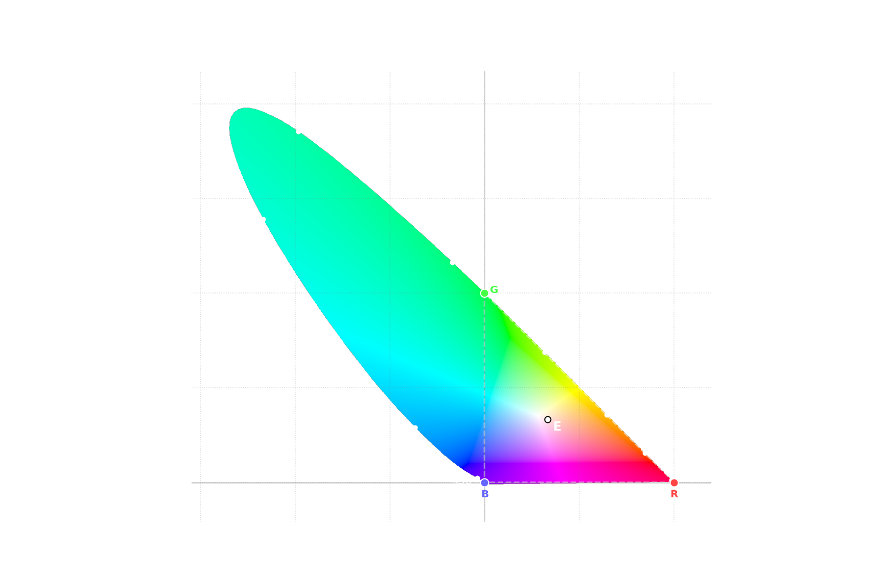
This is a diagram of all possible colors. Every possible color is either inside or on the edge of this diagram. Pure wavelengths of light are on the outside curve. Everything else represent spectrums which include multiple wavelengths of light, including line at the bottom. Point $r={\frac {1}{3}}, g={\frac {1}{3}}$ is Equal Energy point. CIE RGB primary colors are corresponding to - $r=1,g=0$ (Red), $r=0,g=1$ (Green), and $r=0,g=0$ (Blue).
This diagram works, it does provide fine visualization. However, it shows few shortcomings in both the diagram itself and CIE 1931 RGB color space:
- A lot of possible colors in CIE 1931 RGB color space will be represented by negative values. It would be much more practical for all values to be positive.
- CIE rg chromaticity diagram have extremely weird bounds. It has arbitrary range on both axes.
Both of those problems arise from the fact that we arbitrarily picked primary colors to define CMFs. It was neccecary to measure human vision, but we are better off defining another colorspace that would be more practical to work with.
Defining Second Color Space - CIE XYZ
Let’s define requirements for our next color space:
- Defined using CMFs that are greater than or equal to zero for any wavelength.
- One of these CMFs would represent luminance and be exactly equal to CIE 1924 Photopic Luminosity function.
- It will use same Equal Energy spectrum white point.
The first requirement is tricky. We constructed RGB CMFs using primary colors that represented pure wavelengths of light. It turns out you can not represent all other pure wavelength of light using only positive numbers. If you look at rg chromaticity diagram you’ll notice that for any triangle that is completely inside the diagram, there are possible colors that are outside said triangle.
Solution to that is quite simple - you just pick imaginary colors, i.e. colors that are not possible and so are outside the diagram. But now not all colors inside such triangle are possible colors. Fortunately it is not a problem, but it leads us to the last requirement:
- Gamut should be tightly bound, i.e. we should minimize amount of imaginary colors inside our new primary colors
With this last requirement our new color space is actually completely defined. After working out the numbers, you get following transformation matrix:
\[{\displaystyle \begin{bmatrix} X \\ Y \\ Z \end{bmatrix} = \begin{bmatrix} 0.49000 & 0.31000 & 0.20000 \\ 0.17697 & 0.81240 & 0.01063 \\ 0.00000 & 0.01000 & 0.99000 \end{bmatrix} \begin{bmatrix} R \\ G \\ B \end{bmatrix} }\]Let’s visualize our new color space:
With that we now have color space that is defined in terms of objective requirements, and not arbitrarily selected primary colors.
Now, the last step is to create a new visualization for chromaticity, that uses CIE XYZ as a base. Similarly to rg chromaticity diagram, we’ll define x and y as:
And with that we can build CIE xy chromaticity diagram:
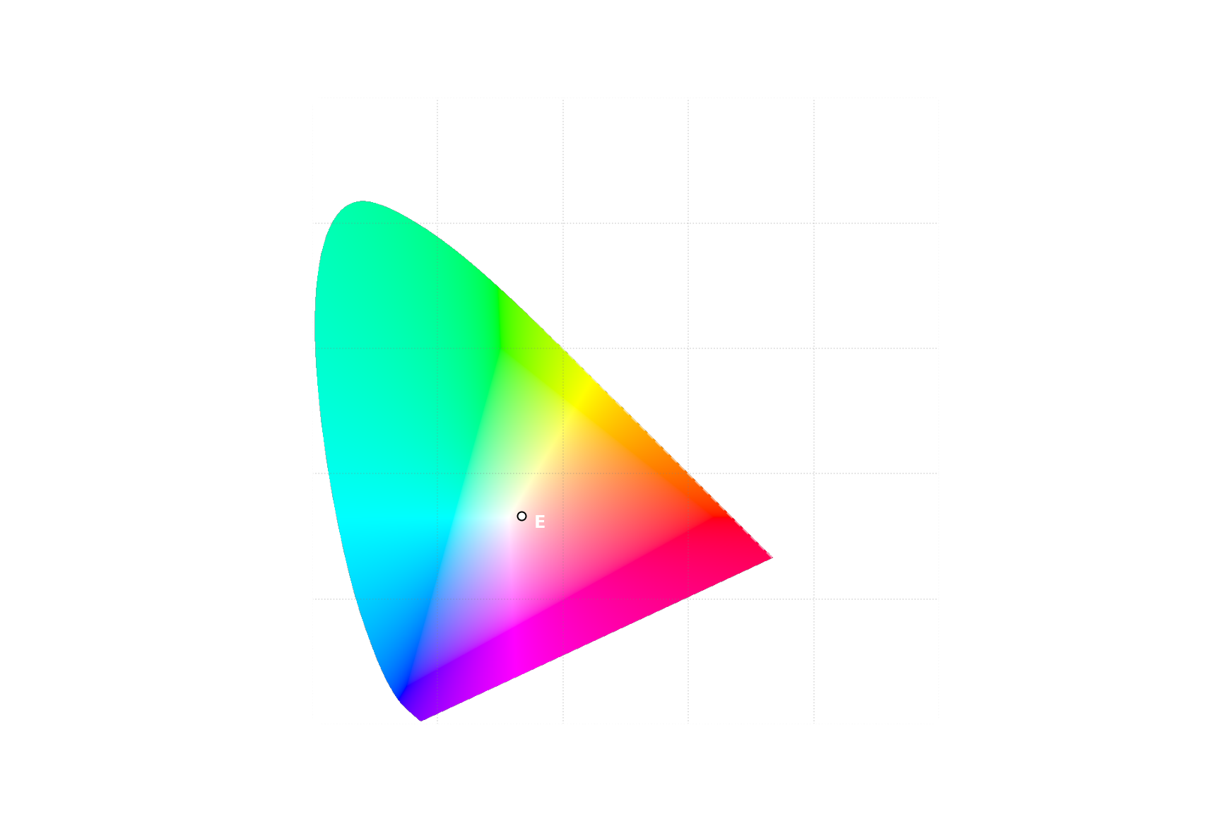
Similarly to CIE RGB, CIE XYZ also doesn’t define which units should be used, so scale is still undefined. But other than that it has very nice properties - it covers all possible colors, you can easily calculate XYZ values from any given spectrum, all XYZ values are positive, and its definition does not rely on subjectively selected wavelengths of light. For all those reasons this is the color space that is used to define primary colors and white point for other color spaces. Let’s see how would CIE RGB be defined:
- Primary Colors
- R - x = 0.73474284, y = 0.26525716
- G - x = 0.27377903, y = 0.71747770
- B - x = 0.16655563, y = 0.00891073
- White Point - x = 0.33333333, y = 0.33333333 (Illuminant E)
With all this theory behind color perception you should now be able to understand benefits WCG is supposed to bring.
Perceived Brightness
Luminance
We already established that perceived eye sensitivity depends on the wavelength - you can’t just take physical units of light intensity and use it for purposes of how eye sees it. We need some other units to describe light in context of how human eye senses the light. In other words, we need 2 different types of units:
- Radiometric - measuring physical intensity of light
- Photometric - measuring human eye sensitivity to light
We know how to measure radiometric units, but how do we convert those to photometric? This is where Photopic Luminosity Function comes into play - it defines this exact relationship.
Conversion from radiometric units to photometric is very similar to what we did to get R, G, B values using CMFs. For monochromatic light source with Radiant flux $\Phi_e$ (in $W$), conversion formula is: $\Phi_V=K_m \Phi_e V(\lambda)$, where $K_m$ is constant 683 lm/W. For non-monochromatic light with Radiant flux $\Phi_e$ (in $W/nm$, representing same value for each wavelength of light) the formula is:
With that you can calculate luminous flux - intensity of light in terms of how sensitive would eye be to such light. However, it is a measure of total, non-directional light intensity, which is not what human eye actually sees. Here’s a visualization of different units:

Human eye sees Luminance - light source scatters light over area of a surface, dividing its energy per area, and then, only the amount that is reflected in the direction of an eye is seen. So to measure eye sensitivity to a given surface we use units of Luminance - $cd/m^2$. It is equivalent to non SI unit called “nit”, which is often used for marketing materials, but we are going to stick to SI units.
Great, we now know what units to use to measure eye sensitivity. But note that we haven’t discussed how it is actually perceived, or that we haven’t used word “brightness” in this paragraph. This is because relationship between eye sensitivity and perceived brightness is not trivial.
Brightness
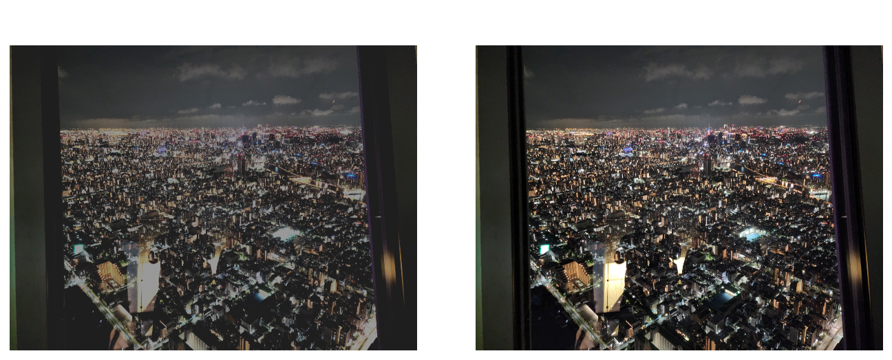
First, let’s look on some nice pictures. Those are very rough estimates of real-world luminance:
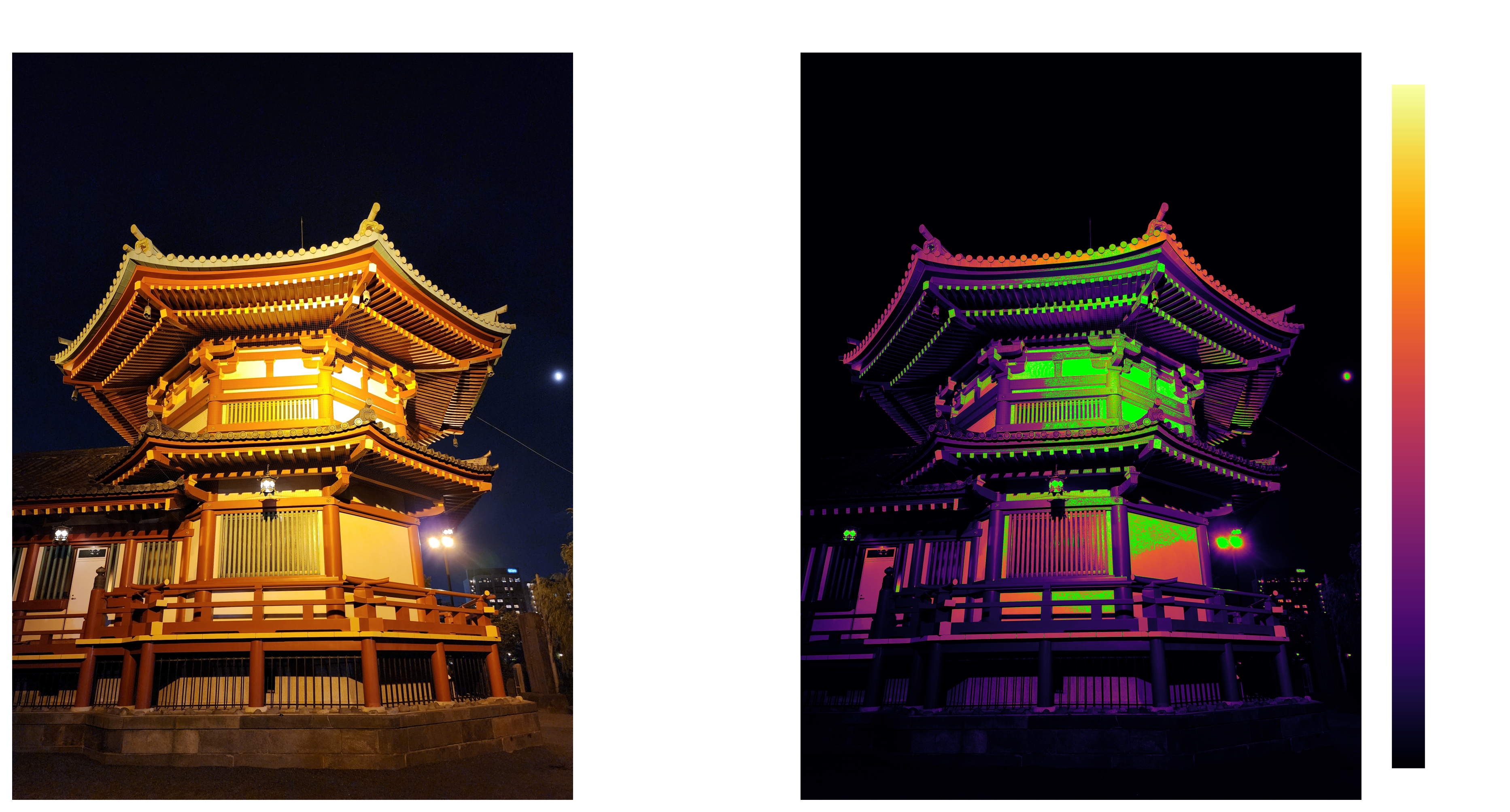
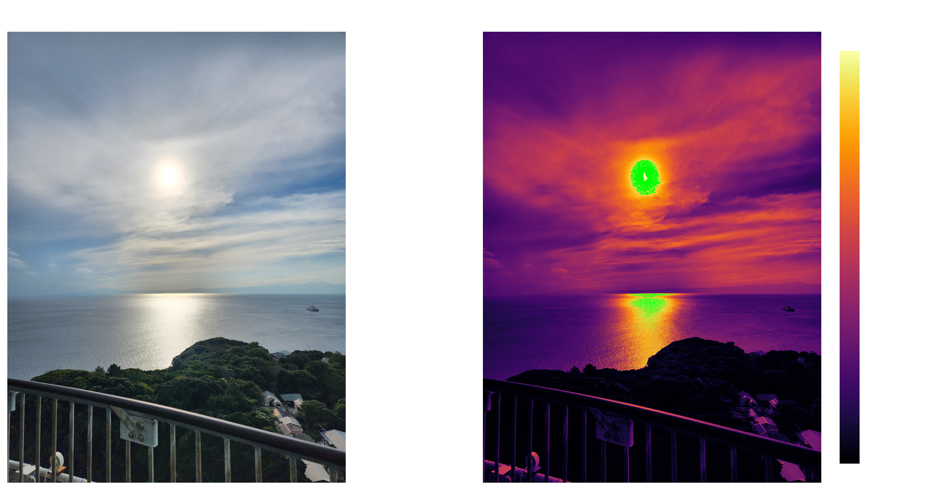
First photo is almost entirely in range 0 – 4 $cd/m^2$, but second one goes all the way to 14000 $cd/m^2$, and that’s with highlights clipped and behind clouds. At the same time, you wouldn’t have any trouble seeing that temple at night, even though it is theoretically 3500 times darker than scene portrayed in the second photo. This shows us range of human vision is incredibly wide.
Another observation is how our eye reacts to luminance. Difference between 0 and 4 $cd/m^2$ on the first photo is quite obvious. However, can you tell a difference between 14000 and 14004 $cd/m^2$? You can not. This is yet another property of human vision - we don’t perceive brightness linearly. Stevens’s power law gives us rough approximation of perceived brightness: $B = kL^{1/3}$, where $k$ is a constant scale. It does not hold up when you get to low luminance values, but it is good enough for general understanding. We’ll look at more accurate approximations later.
With theory behind perceived brightness you should now understand how would wider range of luminance translate to practical improvement.
Standards
Now let’s look at actual standards, how they defined, what are their limits, and where those standards fall short. Up to this point things made sense, but from now on be ready for some many peculiarities.
sRGB
sRGB is the standard for SDR on any modern version of Windows. It was created by HP and Microsoft in 1996, and published as a standard by International Electrotechnical Commission (IEC) in 1999.
When HDR is disabled logic is fairly simple - Windows expect to get sRGB colors from apps, it then transfers those same sRGB colors over the wire to the monitor, and expect monitor to follow sRGB standard.
Specification
If you want to read standard yourself, you’ll probably just google “sRGB standard” and stumble upon one of those 2 documents:
- A Standard Default Color Space for the Internet - sRGB
- How to interpret the sRGB color space (specified in IEC 61966-2-1) for ICC profiles
However, if you read those carefully, you’ll realize that neither of those is the actual standard. Here’s the actual standard - IEC 61966-2-1:1999 Default RGB colour space - sRGB. But you won’t get to read it unless you pay ~360$.
This is the first hurdle when trying to deal with sRGB standard - everyone works with it, and yet virtually no-one have actually read it due to this paywall. If you ever used a color picker in any kind of app, chances are, that you either directly picked sRGB colors, or at the very least sRGB was used to show you what did you pick.
Ok, so you decided to not pay 360$ to read sRGB standard. There are those 2 documents google shows you. You would think that those would be a good reference, right? Right?
Let’s start with the first one. It starts fine, but then you get to “Gamma and the desired CRT gamma of 2.2” part. What does gamma mean in this context? If you didn’t know what gamma may mean before reading this document you’ll be completely lost. They try to define what gamma is, but in doing so they use word “gamma”. They somewhat clear it up in “CRT Gamma” section, but this version is not easy for comprehension. It does cover a lot of details of sRGB, but it is more confusing than it needs to be, and it is still not the actual standard.
Second document is even worse. You only need to get to point 2, and it is already straight up incorrect:
2. Reference display‘Gamma’: Approximately 2.2 (see precise specification of color component transfer function below).
This directly contradicts the actual standard, uses ambigious term “gamma”, and doesn’t even try to explain what “gamma” actually means.
So, we need to look at the actual standard.
And you know what the best part is? In the actual standard the word “gamma” is only used in a single section - Ambiguity in the definition of the term “gamma”.
Color Gamut
Set of primary colors is often called color gamut. Most color spaces do not allow negative values, including sRGB. Only colors that are inside the triangle defined by primary colors are representable in such color spaces. The wider the gamut - the more saturated colors you can get. On the other hand, the wider the gamut - the more sophisticated displays you need to use to reproduce those colors.
Let’s look at the exact definition of sRGB Color Gamut:
- Primary Colors
- R - x = 0.6400, y = 0.3300
- G - x = 0.3000, y = 0.6000
- B - x = 0.1500, y = 0.0600
- White Point - x = 0.3127, y = 0.3290 (Illuminant D65)

Unlike CIE RGB, primary colors of sRGB does not lie on the edge of the chart. Reason for that is simple - it is very hard to produce pure wavelength of light required to get to the very edge of the chart, while the goal of the standard to be achievable with reasonably priced consumer displays.
Transfer Function
This is the part which CIE didn’t have to deal with. If you want to simply define a color space, you just need an algorithm to get to numbers, and you are done. However, in real world, you have some practical hurdles you have to overcome.
First one is physics. If you are to make a color standard, it needs to be achievable on reasonably priced consumer displays. At the time when sRGB standard was being created, it meant it should be acvhievable with a CRT display. Such a display consists of an electron gun and a phosphorus coated screen. Electron gun receives singal as a voltage and shots electrons at phosphorus. Relation between input voltage level and resulting luminance is not linear, so we need to compensate for that.
Another hurdle is that computer don’t operate on abstract numbers, they operate on bytes. You have to define exact relation between bytes and colors, and do it in a way that most amount of data can be stored in the smallest possible footprint. 1 megapixel uncompressed photo would have 3 million of those numbers. If you store each number as 32-bit float, you get 12 MB of data. If you drop that from 32 bits to 8, you go from 12 MB to just 4 MB. It may not look like much by today’s standards, but in 1999 it wasn’t uncommon to have only 128 MB of RAM, or even less. Single photo taking 9.3% vs 2.3% of total RAM is a big difference.
And RAM is not the only challenge. To present image to a display you need to transfer full uncompressed image over a wire many times a second. DVI Single Link, which released same year sRGB standard got published, only supports signal up to 1920×1200px at 60hz using 8 bits per color channel. If you could go from 8 bits to 32 bits, you would have to significantly drop resolution, refresh rate, or both.
So it is really important to have as efficient of a color representation as possible. Fortunately we’ve just discussed one quirk of human vision that helps us with that - human vision is non-linear, meaning that if we remap linear luminance values using appropriate function we can compress wide range of luminance without losing much perceived data.
This is what a “Transfer Function” is - function that defines transformation between any of the following: captured light, electrical signal, and display output. Electrical Signal may be either analog or digital.
There are 3 types of transfer functions, depending on what transformation they perform:
- Opto-Electronic Transfer Function (OETF) - Transfer function that defines transformation from scene light into electrical signal.
- Electro-Optical Transfer Function (EOTF) - Transfer function that defines transformation from electrical signal into display output.
- Opto-Optical Transfer Function (OOTF) - Transfer function that defines transformation from scene light into display output. It is a composition of OETF and EOTF.
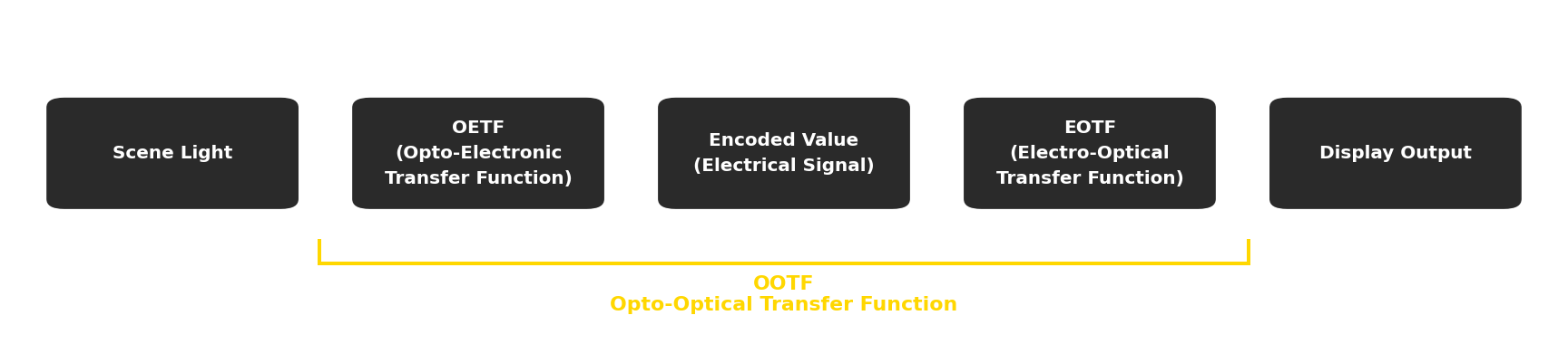
First, you get linear luminance values captured by camera or generated by a rendering engine. Then you use OETF to transform those values into electronic signal and sent to a display. And finally, after display receives that signal, it would use EOTF to convert it to linear luminance values to present on the screen.
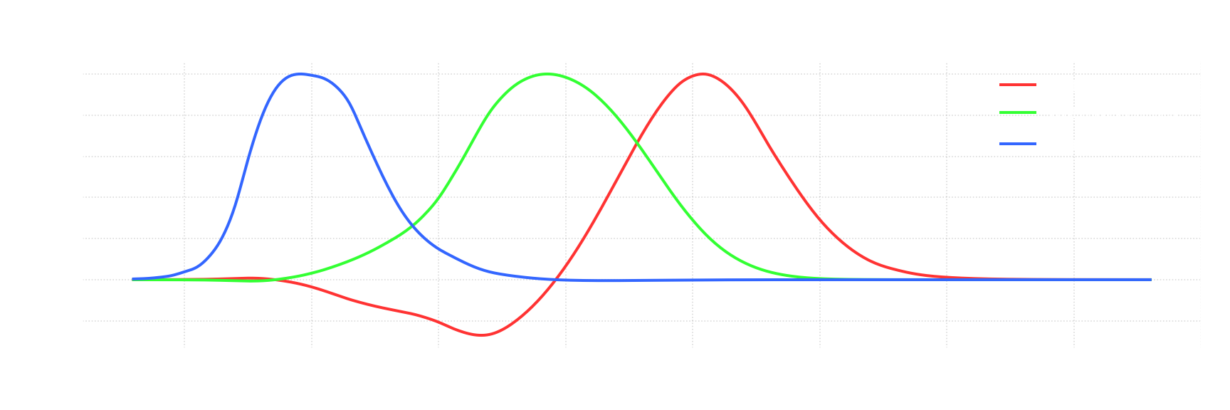
sRGB standard defines OETF as:
\[{\displaystyle L'=T_{OETF}(L_1)={\begin{cases} 12.92\cdot L_1,&L_1\leq 0.0031308 \\[5mu] 1.055\cdot L_1^{1/2.4}-0.055,&L_1>0.0031308 \end{cases}}}\]And EOTF as:
\[{\displaystyle L_2=T_{EOTF}(L')=(L' + k)^a }\]where
- $L_1$ - is a scene light value in range $[0, 1]$ normalized to peak scene luminance
- $L’$ - is an encoded/electrical value in rage $[0, 1]$
- $L_2$ - is a display output value in range $[0, 1]$ normalized to peak display luminance level
- $k$ - is a display characteristic of “display mode offset” (black level)
- $a$ - is a display characteristic of “display input/output characteristic” (more widely known as just “gamma”)
The logic behind those functions is:
- EOTF is just what CRT display do, we don’t really have control over that.
- OETF was selected so that it closely matches inverse power 2.2 function, with a small linear segment to allow for invertability in integer math. The number 2.2 was selected because it was avarage CRT display input/output characteristic - HP conducted testing of CRT computer monitors from many brands to find the average.
Now that we defined OETF and EOTF, we also implicitly defined OOTF, as it is the composition of the OETF and the EOTF:
\[L_2=T_{OOTF}(L_1)=T_{EOTF}(T_{OETF}(L_1))\]Note OETF and EOTF are not inverse of one another, and so OOTF is not an identity transform. This is the first key to understanding state of HDR on Windows - sRGB transform has an implicit transform for all color values, and content is often mastered accounting for that.
Reference Display
So far, the EOTF is defined in a way that is too abstract to be usable for an actual color space. If you create content, you can’t just leave those $k$ and $a$ parameters up to a chance. If multiple people work with multiple different displays, you need to have all those displays to consistently reproduce image in the same way.
For this exact purpose sRGB standard defines a Reference Display:
- Display luminance level - 80 $cd/m^2$
- Display model offset (black lelel) - 0
- Display input/output characteristic - 2.2
This both defines exact luminance for 1.0 point (80 $cd/m^2$), and transforms EOTF into a simpler function:
\[{\displaystyle L_2=(L')^{2.2} }\]Also, now that we have concrete EOTF we can plot all the transfer functions:
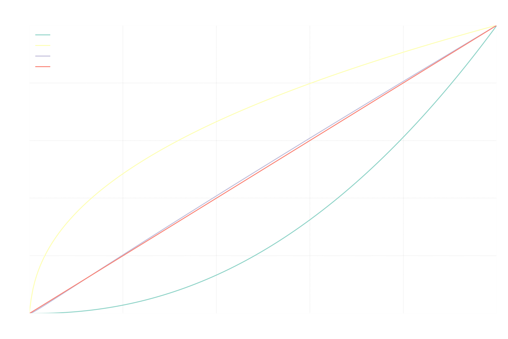
The difference between OOTF and identity function is this implicit transform that is applied to any sRGB value.
HDR10
HDR10 is a color space used by all HDR displays.
Specification
Specification for HDR10 is openly available on Ultra HD Forum website - Ultra HD Forum Guidelines Orange Book – Foundational Technologies for Ultra HD.
Color Gamut
HDR10 uses Recommendation ITU-R BT.2020 (aka Rec. 2020) standard for its color gamut.
- Primary Colors
- R - x = 0.708, y = 0.292
- G - x = 0.170, y = 0.797
- B - x = 0.131, y = 0.046
- White Point - x = 0.3127, y = 0.3290 (Illuminant D65)

Unlike sRGB, those primary colors do go to the very edge of xy chromaticity diagram, and so are represented by monochromatic light. The goal is to represent as wide as possible of a color gamut, without covering any imaginary colors, even if that means that current consumer display won’t be able to fully cover such a color gamut. That way future displays can enlarge their color gamut without having to adopt a new standard.
Transfer Function
HDR10 uses transfer functions known as “Perceptual Quantizer” (PQ for short) defined in Recommendation ITU-R BT.2100 (aka Rec. 2100) standard.
The way it defines transfer functions differs from sRGB in multiple ways:
- Standard defines the max luminance level, so after applying EOTF you get exact absolute luminance values, not relative to displays peak luminance.
- Defined transfer functions are “reference”, meaning that standard allows for deviations from reference transfer functions.
- Reference transfer functions are defined exactly, without relying on display properties. The only exception is scale for input values for OETF, which are user-defined.
- Since OOTF is a composition of OETF and EOTF, you only need to define 2 out of those 3 functions. sRGB decided to define OETF and EOTF, implicitly creating OOTF. In contrast, “Recommendation ITU-R BT.2100” defines reference EOTF and reference OOTF, implicitly creating reference OETF.
First - standard defined max luminance. Logic here was similar to color gamut - select value that is not achievable by current displays, but that future displays can take advantage of. However, if you pick higher value, you will need to reserve digital values that represent currently unused range. This is a tradeoff - higher max luminance result in a more future-proof standard, while lower max luminance result in more efficient encoding for current displays. In the end value of 10000 $cd/m^2$ was chosen to be max luminance. For reference, at the time of writing, entry-level consumer HDR displays achieve peak luminance of around 300~450 $cd/m^2$, and high-end ones achieve 1000~1700 $cd/m^2$.
Then comes reference EOTF, which is what usually referred to “PQ”. At the time it was developed, monitors were already complex enough to implement EOTF in software, so we were no longer limited by physics of underlying display technology. The only goal of PQ was to closely match how human eye perceives luminance, to maximize amount of perceived accuracy per bit. Predefined luminance for 1.0 point also helps. Minimum perceivable difference in luminance level directly depends on the absolute luminance - at 0.001 $cd/m^2$ you can only perceive difference of over 10%, at 1 $cd/m^2$ you can perceive difference of about 1%, and at 1000 $cd/m^2$ you can perceive difference of about 0.4%. Connection to absolute units lets you figure out how to distribute digital values to match this perceivable difference as closely as possible.
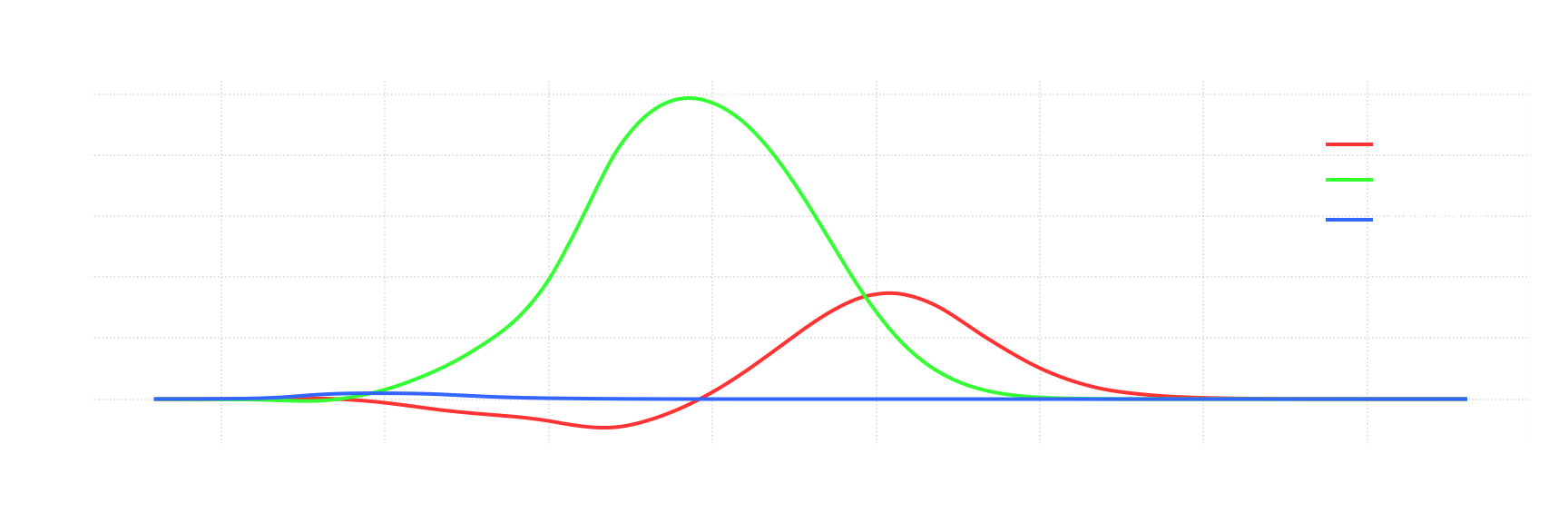
PQ EOTF is defined as:
\[{\displaystyle L_2=T_{EOTF}(L')=\left({\frac {\max[((L')^{1/m_{2}}-c_{1}),0]}{c_{2}-c_{3}\cdot (L')^{1/m_{2}}}}\right)^{1/m_{1}} }\]where
- $L_2$ - is display output value in range $[0, 1]$ normalized so that 1.0 point corresponds to luminance level of 10000 $cd/m^2$.
- $L’$ - is encoded/electrical value in range $[0, 1]$.
- $m_{1}={\frac {2610}{16384}}={\frac {1305}{8192}}=0.1593017578125$
- $m_{2}=128{\frac {2523}{4096}}={\frac {2523}{32}}=78.84375$
- $c_{1}={\frac {3424}{4096}}={\frac {107}{128}}=0.8359375=c_{3}-c_{2}+1$
- $c_{2}=32{\frac {2413}{4096}}={\frac {2413}{128}}=18.8515625$
- $c_{3}=32{\frac {2392}{4096}}={\frac {2392}{128}}=18.6875$
Next one is OOTF:
\[{\displaystyle L_2=T_{OOTF}(L_1)=G_{1886}(G_{709}(L_1)) }\]where
- $L_1$ - is scene light level value in range $[0, 1]$
- $L_2$ - is display output value in range $[0, 1]$
- $G_{709}(x)={\begin{cases}1.099\cdot(59.5208x)^{0.45}-0.99,&1>=x>0.0003024\\267.84x,&0.0003024>=x>=0\end{cases}}$
- $G_{1886}(x)=100x^{2.4}$
The reasoning behind not having direct 1 to 1 mapping for this OOTF is out of scope for this blog post.
And now that we defined 2 out of 3 transfer functions we have also implicitly defined 3rd one. For sRGB, math was trivial: $L_2=T_{OOTF}(L_1)=T_{EOTF}(T_{OETF}(L_1))$. It is not so trivial in our case.
From this point please pay attention, it is going to get more confusing. We already talked about following transfer functions:
- OETF - scene light → electrical signal
- EOTF - electrical signal → display output
- OOTF - scene light → display output
But those only get you forward, from scene light to electrical signal and to display output. In reality, you often need to work things back, in which case you need one of 3 other transfer functions:
- Inverse OETF - electrical signal → scene light
- Inverse EOTF - display output → electrical signal
- Inverse OOTF - display output → scene light
Intuitively, inverse “Opto-Electronic Transfer Function” should just be “Electro-Optical Transfer Function”, but it is not, as values you work with are different. O in “OETF” indicates “scene light”, but O in “EOTF” indicates “display output”. This is the second key to understanding state of HDR on Windows - it is easy to acidentally switch up OETF and inverse EOTF, because intuitively those should have been the same thing.
Now we can actually define reference OETF:
\[{\displaystyle L'=T_{EOTF}^{-1}(T_{OOTF}(L_1)) }\]where
\[{\displaystyle T_{EOTF}^{-1}(x)=\left({\frac {c_{1}+c_{2}\cdot x^{m_{1}}}{1+c_{3}\cdot x^{m_{1}}}}\right)^{m_{2}} }\]With this you should understand how is HDR signal defined and how exactly it expands color gamut and dynamic range.
Display output on practice
Any display will have some degree of inaccuracy, and that’s ok - consumer tech has to be cheap first, and good second. However, display manufacturers may decide to deviate from the standard on purpose. Consumers want displays that are good, and that doesn’t neccecarilly imply accurate.
SDR
There are multiple things displays can change that affect resulting output:
- Peak Luminance
- EOTF
- Color Gamut
Peak Luminance
SDR displays made for Windows usually have peak luminance level way above what sRGB Reference Display has. But that is fine, standard allows for that, and there’s not much of a difference in resulting perceived image. In fact, it is almost always configurable with an option called “Brightness” in monitor settings, or, in case of laptops, directly configurable within Windows.
The need for it is simple - you would want drastically different max luminance depending on whether you are in a dark room or outside under direct sunlight.
So, this is neither a deviation from the standard, as it is explicitly allowed, nor does it introduce any real difference for how content is going to be perceived.
EOTF
From my limited testing, displays meant for use with Windows generally try to follow sRGB standard, with black levels being at or near 0 and display input/output characteristic of 2.2, same as sRGB reference display.
There may be some options to change that, e.g. my monitor has an option called “gamma” that allows to change display input/output characteristic and “contrast” that works as a multiplier to input values before power function is applied. But you need to go out of your way and change those settings from the default value to deviate from the standard.
Color Gamut
Imagine you going into an electronics shop. In front of you there are 2 monitors:

Which one will you buy? Most people will probably pick the one on the right. Without checking how accurate it is, most people would select monitor just because it “looks more saturated”.
Displays with color gamut larger than sRGB have been widely available for a long time. Having larger color gamut means you can display more saturated colors. But as long as display runs in SDR mode, computer sends sRGB encoded data, which can’t represent colors beyond sRGB gamut.
So how can display take advantage of wider color gamut? Display manufacturers have 2 options:
- Just don’t
- Stretch sRGB data onto a larger color gamut
Pick first option and lose most customers to your competitor. Pick second option and you are violating sRGB standard. Here’s a real example:

Larger triangle is color gamut of AOC U27G4XM monitor, smaller is sRGB standard gamut. When using default settings, monitor stretches all the colors from smaller gamut to larger, meaning that color representation is not accurate and colors are much more saturated than intended. And this is not a recent development. It has been this way for years, meaning that many people are now used to overly saturated colors. This is the third key to understanding state of HDR on Windows - when displaying sRGB content, some people want colors to be more saturated than what sRGB standard dictates.
HDR
HDR is much more complicated in terms of how it is implemented in displays. There are many things that force display manufacturers to deviate from the theoretical ideal HDR10 implementation:
- Color Gamut - Modern displays can not cover full HDR10 color gamut
- Peak Luminance - Modern displays can not reach HDR10 max luminance level of 10000 $cd/m^2$
- Peak Luminance Window - Some displays will not be able to reach peak luminance on whole display at once
- Raised Black Level - Some displays will raise black level when in HDR mode
Color Gamut
Let’s look at color gamut of same monitor, but this time compare it to HDR10 color gamut:

Larger triangle is Rec. 2020 color gamut, used in HDR10 standard, smaller one is displays color gamut. When running in HDR mode, display may receive color values that are within Rec. 2020 color gamut, but are outside of displays color gamut. In such a case it needs to still show something and so there’s a need to map such colors to something display can reproduce.
Most displays just clamp colors to their color gamut, which works well in most cases. SDR content is usually completely unaffected, since displays usually cover whole sRGB color gamut, and so no clipping would be required. HDR content may appear less saturated than intended, but there are some factors that make it much less of a problem than you would expect:
- Only extremely saturated colors would require clamping. Most HDR content would use such colors sparingly, minimizing area that would need clamping in the first place. Some HDR content may just not go far enough to extremely saturated colors to trigger clamping, or not even go outside sRGB color gamut, and would only take advantage of HDR’s extended luminance range.
- Clamping doesn’t change colors dramatically. If input was extremely saturated green, it would still be decently saturated green after clamping.
- There are almost no real-world examples where clamping would lead to meaningfull loss of information, where you could see something before clamping, but can’t after.
This is HDR10 standard working as intended. Different displays can have different color gamuts and use its full range with only minor compromises.